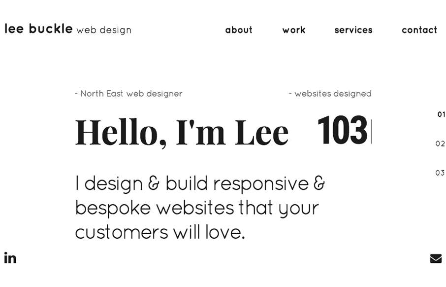
Such a smart site design for Lee Buckle’s portfolio. I dig the way the navigation works, simple links and then as you scroll you get the “more” hamburger thing. Simply smart. I also really like the overall break down of info into the 3 main sections that’s done on the home page. Beautiful work.
From the Designer:
I’ve been designing mainly eCommerce websites for the past 3 years, usually on rigid wireframes. I recently went freelance and decided to break the mould and build my first website.
I designed this website with SEO in mind so that probably compromises the design but overall I’ve had only positive feedback and would like to see what non-biased people might have to say.
Submitted by: Lee Buckle
Role: Designer & Developer
Country: United Kingdom


I do like this design, the only thing I can say is that the “About me” timeline thing is hard to read on mobile phones.
It’s a long line of text with a few words on every line.
Hi, thanks for the input. The site is still a work in progress, it’s my first attempt at developing a website, I’d only dabbled before and to be honest I should have put more thought into the mobile side when I was designing it. It’s still a work in progress though and I hope to have it looking good on mobile devices soon 🙂
Hey, thanks for the input. Yeah I went a bit desktop-design-heavy with that page but It’s still a work in progress and I’m working on optimising it more for mobile 🙂
No problem, still think you can have the timeline, is a different way, so that the portions of text can use the with of the mobile, I attached an Idea for your timeline.