
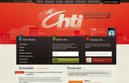
Neat vibe to the design of this site for me. The color palette here is very nice and the subtle textures are well done. There is however a ton of stuff going on in this design, I know that that’s sometimes necessary and the designer has done a good job of balancing it all out I think. I’d just like to see the content simplified. I can’t read the language here but what’s interesting is I can still tell it’s a bit overwhelming.




0 Comments