
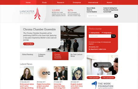
I’m loving this new trend of University websites that are responsive. This one here for Lancaster University is no exception. Very craftily executed responsive design and was a pleasure to discover in our submission queue. I particularly like the single rounded corner on some of the main boxes/sections, keeps it feeling dynamic.




0 Comments