krispy krush

krispykrushcom

Submitted by Marie Antoine. Designer & Developer.

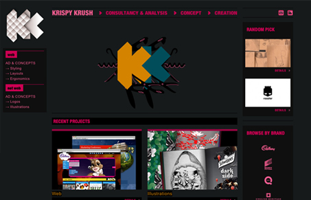
It is a really clean and nice website. The design and projects presented worse to be seen. I hope you gonna like it.

Cool looking colors, the bright red paired with the dark background gives it a neat feel. The fixed navigation in the sidebar is a cool effect as well. There’s also some neat little simple interactive elements used throughout the site.

1 Comment

  1. marie antoine

    Thank you for adding my website 🙂

    Reply

Submit a Comment

Your email address will not be published. Required fields are marked *

News & Articles

Sign-Up: Enhancing Conversions through good UX

Sign-Up: Enhancing Conversions through good UX

Optimize your website’s sign-up process by focusing on clarity, ease, and user mindset. Clearly explain the purpose, benefits, and steps, and use social proof to build trust and drive conversions.

The Essential Guide to Getting Started on Freelance Writing

The Essential Guide to Getting Started on Freelance Writing

Explore the lucrative and fulfilling world of freelance writing with our essential guide. Learn about specialties like blogging, social media, article, and technical writing. Build a portfolio, find work, set up your business, and discover the potential earnings. Embrace the freedom of working from home and follow tips for success in your dream career.