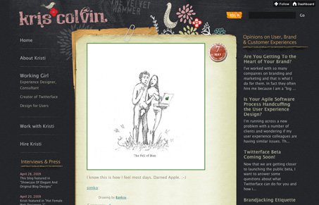
I love seeing what people can do with Tumblr, this site is really very nice. The real-world elements and hand made sketches is what really makes this design sing.
Glassmorphism: The Transparent Design Trend That Refuses to Fade
Glassmorphism brings transparency, depth, and light back into modern UI. Learn how this “frosted glass” design trend enhances hierarchy, focus, and atmosphere, plus how to implement it in CSS responsibly.


I’m not a fan of sites where the elements are supposed to look like real objects. I think the main links could be more conspicuous and they would benefit from you-are-here indicators. Also, I don’t see why there would be two separate mail-to links in the navigation. I like grain-like background and its colour, though.
The navigation is a bit clunky on this site, probably because it’s a tumblr site, not that the fact it’s tumblr is a defense for confusing linkage.
I have to say I often like sties with real world objects worked in, that’s just me and definitely a taste thing.