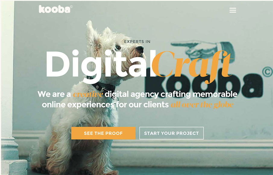
I had to get one Irish design company on St. Patricks’s Day, even if it is late in the evening there – and with Kooba, think it’s a good one (ther also might be a good chance that they won’t see this for a couple of days – St. Pat’s isn’t just one day there). Besides the fact they’ve won agency of the year for three years – every page looks like a landing page – vibrant, well laid out, great image and video backgrounds – also like the hamburger menu that moves down the screen with you – allowing scrolling without losing real estate at the top of the page.
Glassmorphism: The Transparent Design Trend That Refuses to Fade
Glassmorphism brings transparency, depth, and light back into modern UI. Learn how this “frosted glass” design trend enhances hierarchy, focus, and atmosphere, plus how to implement it in CSS responsibly.


0 Comments