
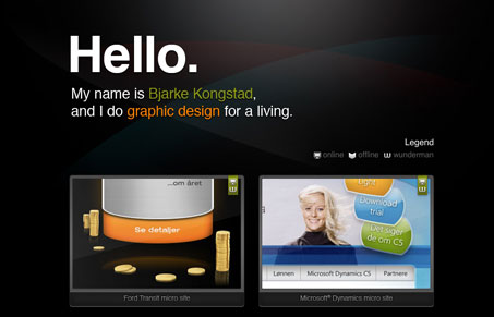
This site works mostly as a really fancy business card with work samples. It’s quite simple and effective if you think about it this way I think. There’s of course the lightbox style script launching work samples in the pop up window, that never gives me the full perspective on the designer’s work that i’d like to see, but it’ll always work enough in a pinch. Good dark background and blended colors in the background make this site stand out slightly from the rest.


Fitts’s Law: Why the Easy Button Wins
Large, close targets are faster to hit than small, distant ones, that’s Fitts’s Law. A look at the 1954 rule behind buttons, prime and magic pixels, thumb zones, and dark patterns.


0 Comments