
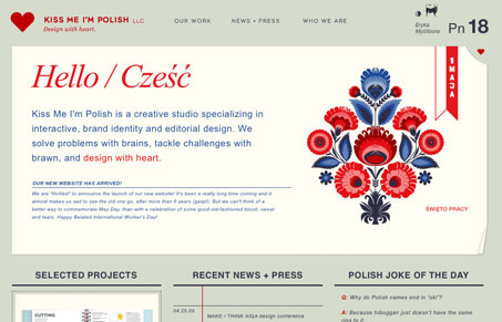
This is a wonderfully, deceptive website design. When you first look at it it looks really simple and the more you spend time here you realize there has been a ton of work put into this thing with all the little details here and there and the depth of copy. I especially like the non-standard way they’ve put the “our work” section together, that really got me thinking about how I do my own portfolio page views. This site has really inspired me to look at how I can incorporate more details into work i’m doing right now.


Fitts’s Law: Why the Easy Button Wins
Large, close targets are faster to hit than small, distant ones, that’s Fitts’s Law. A look at the 1954 rule behind buttons, prime and magic pixels, thumb zones, and dark patterns.


0 Comments