
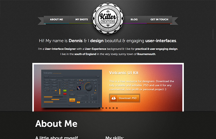
There’s a lot of good design packed into this website. So many blocks of details and very dense visually. I like the interactions the most, the fixed nav that appears as you scroll and then the different design looks as you size down the browser for the different responsive width looks. The experience level graphics and the little envelope contact form thingy. Wonderfully fun yet pro looking design here.


Fitts’s Law: Why the Easy Button Wins
Large, close targets are faster to hit than small, distant ones, that’s Fitts’s Law. A look at the 1954 rule behind buttons, prime and magic pixels, thumb zones, and dark patterns.


0 Comments