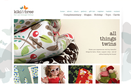
Kiki & Bree is a twin apparel website, that alone is an interesting concept for a business. The design of the site is pretty straight-forward, I like the photography it’s what really sells the website for me. It’s clean and crisp photography that was clearly well directed. I love the colors in the branding and the background imagery helps make the overly rigid design feel softer. It’s just a nice simple mix of the soft and hard edge feel that gives it the visual contrast that I like.
Glassmorphism: The Transparent Design Trend That Refuses to Fade
Glassmorphism brings transparency, depth, and light back into modern UI. Learn how this “frosted glass” design trend enhances hierarchy, focus, and atmosphere, plus how to implement it in CSS responsibly.


Hasn’t this site already been featured? Oh well. It’s worth re-posting because it’s been an inspiration for a while. The photos really are top-notch and I also like cool pastels in the background.
Ugh, you’re right Tim! Didn’t catch that since it was a draft as well as a previously posted article.
I’ll try and be better at making sure of no re-posts. I’m glad we have people like you reading UMS to keep us straight.