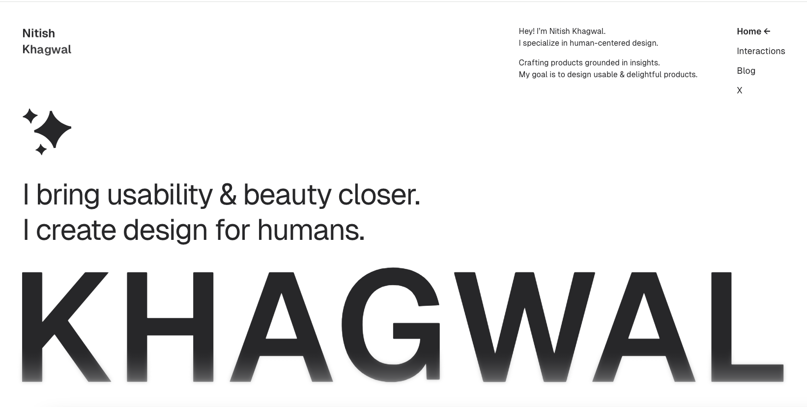
Really nifty minimal design approach. It’s hard to do to minimal well. It’s not simply about being ‘simple’ – it’s about having less or just having what’s needed. This website is minimal and also has interactions and fun in places where they are pleasantly surprising. Well done.
Glassmorphism: The Transparent Design Trend That Refuses to Fade
Glassmorphism brings transparency, depth, and light back into modern UI. Learn how this “frosted glass” design trend enhances hierarchy, focus, and atmosphere, plus how to implement it in CSS responsibly.


0 Comments