
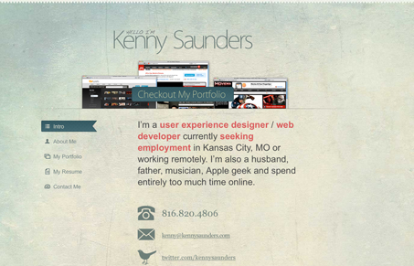
Cool personal site for Kenny Saunders. A portfolio/introductory website, it does the job well. I like the fixed background image and the mixed column layout on all the different pages. Subtle yet nice. The site is overly clean and straight forward in it’s layout, that’s great because over complicating it could have made it look too forced. As it is it has nice spacing and tone.




0 Comments