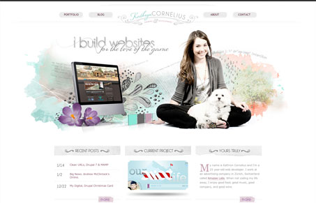
I always love a site that conveys the designer’s personality, it’s like you get to peer inside their head to see what they’re like. This site is a great example of that but it’s totally different from what you’d expect to see from a web designer today. I say that because I always expect to see super large headline text, lots of web type trickery and stuff, this one has puppies and sketches that look like they’d come from someone’s high school notebook – and that’s just totally awesome. It tells the story of who Kathryn is and I love it. Great stuff here!
Glassmorphism: The Transparent Design Trend That Refuses to Fade
Glassmorphism brings transparency, depth, and light back into modern UI. Learn how this “frosted glass” design trend enhances hierarchy, focus, and atmosphere, plus how to implement it in CSS responsibly.


Gene, thank you very much for such a kind a write-up. I’m flattered to appear in this gallery and absolutely love your analysis of my site. 🙂
Thanks Kathryn, Glad you liked it!