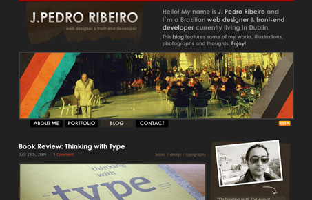
This is just a straight up nice layout with some interesting pieces to it. I like the header area and the right sidebar, that texture used in the sidebar is pretty good. I would like to see some differentiation from home page/blog and the other sections, since the portfolio is a little week on detail and just not full enough to carry that same layout.
Glassmorphism: The Transparent Design Trend That Refuses to Fade
Glassmorphism brings transparency, depth, and light back into modern UI. Learn how this “frosted glass” design trend enhances hierarchy, focus, and atmosphere, plus how to implement it in CSS responsibly.


0 Comments