
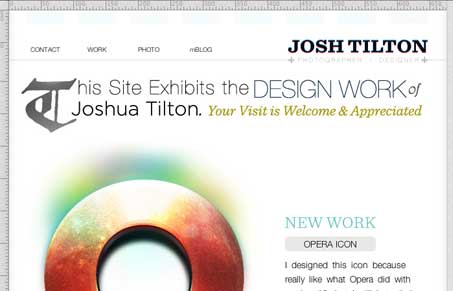
I like the light and airy feeling of this design, the way the illustration is worked into the home page really adds to that too. There are some neat visual things happening with the design, the coloring and subtle textures are nicely used. Some things are neat but unexplained like the photoshop style rulers and movement with the navigation mouse over states, but overall it’s a really nice looking design that I enjoyed looking through. There’s a really nice photography portfolio of the designer’s that’s linked off this site you should check out as well.




0 Comments