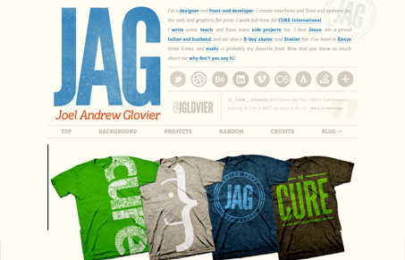
Dropping in on Joel’s site is like staring at a giant wall filled with bins of all your favorite candy. Everything is good and everything is your favorite but you can’t digest it all at once so you hop and skip around until well…I think you just keep going. Before you think I’m saying that’s a bad thing, let me say this. Joel seems to have a ton of talent and although his site doesn’t hold back, that’s actually what I kind of love about it. If ever there were a visually rich site, this would be it. The smorgasbord of texture, color, circles and great type seems to hold together giving space where needed and adding every bit of interest along the way.
If I had to guess, I’d say this site represents just as much of the designer as the designs. It’s bold, personal, and full of life. Joel, if you’re a boring introvert, please let me know I’m wrong.
One criticism I have is that with all the looking around I did at first, I didn’t even realize there was a navigation menu to help carry me through the site. It wasn’t such a huge deal because my natural reaction was to just scroll through and explore. It also looks like he’s working on a mobile, possibly responsive, version of this site. I’ll be interested to see how he handles containing all this goodness into a reduced format.


Hey Maria!
Thanks for the incredibly gracious review. And you’re right, I’m DEF not a boring introvert – I’m an enthusiastic one. ;-P
Good call on the nav. I originally had the nav links all in blue, but felt like they stood out too much. Maybe that wasn’t a bad thing after all. I’ll have to reconsider that.
The responsive version is well underway on my local, so I’ll come back and drop a comment when it’s live!
Thanks again!
You’re welcome Joel…and glad to hear you’re anything but boring and introverted. 🙂
Definitely let us know when you let the responsive version loose!