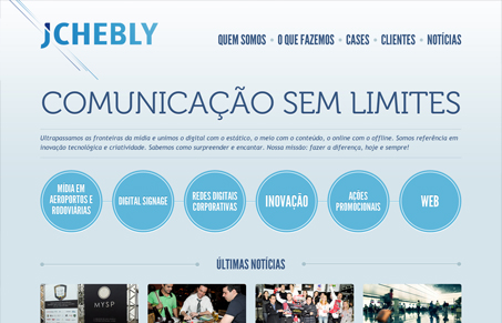
Very cool, almost minimal feel to this design. I love the light blue everywhere, it gives it a nice airy vibe. The horizontal lines behind the logo are nice too, they really drive your eye in toward the circles.
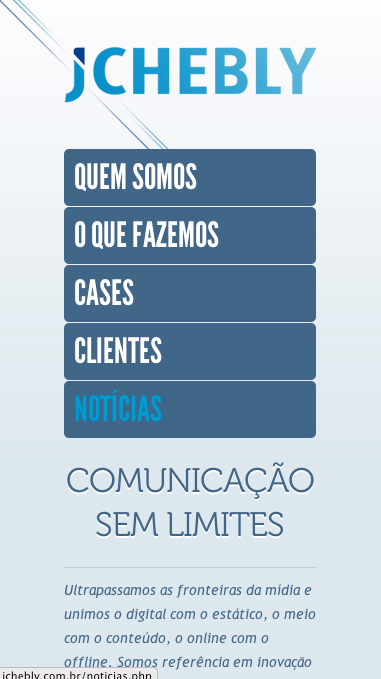
The smaller screen size is quite beautifully done too. I’d like to know whether the designer for this started out mobile first or full screen.


0 Comments