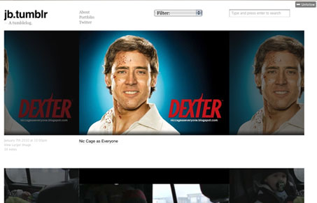
This site baked my noodle. At first I just started scrolling down then I realized something weird was going on. The background was doing something weird but I couldn’t quite put my finger on. It took a minute to really grasp what was going on but it’s actually a really simple little css trick where the background of each post is fixed, and it tiles within it’s own container. It’s a bit of a trippy effect, almost so much that it distracts from the content. Once you get beyond that, the site is nice and clean, with good content, mostly about music. Good job, Jarred.
Glassmorphism: The Transparent Design Trend That Refuses to Fade
Glassmorphism brings transparency, depth, and light back into modern UI. Learn how this “frosted glass” design trend enhances hierarchy, focus, and atmosphere, plus how to implement it in CSS responsibly.


That is a nice effect, I think it’s more the effect that the site is showing off (the designer’s ability to make something trippy) over the actual content itself.