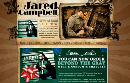
Nice looking musical artist site, those are often way over the top. Subpages (contact page) seems to fall apart though.


The Call to Action, Revisited
The Call to Action hasn’t changed in a decade, but the bar has. A fresh look at prominence, copy, mobile tap targets, and accessibility, with lessons from three major design systems.


I like the grunge look, but a few of the subpages are washed out and break. Also the background is tiled – looks bad on a large monitor.