
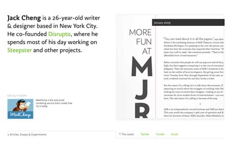
Pretty smart looking blog design, I love the way each post has unique layout elements going on. The past post grid at the bottom of the main page is also clever. The intro text with the matching ‘current post’ space in the top portion of the page works really well in splitting my attention equally. I really like this layout.




the font embedder makes the fonts look extremely pixelated on a PC. Kinda ruined it for me