
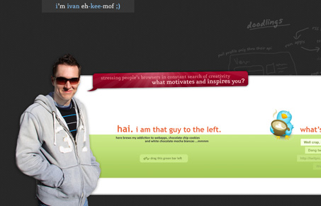
Neat experimental design here. I don’t like the click and drag to scroll to the right to see the content concept at all for client level production websites, but I love the fact that it’s on his personal site and he’s experimenting and pushing the limit on usability with his site. The visual design is pretty good on top of it all, so this makes for a very compelling experiment that’s worth checking out.




I really liked the drag zone on your website. Cool work dude.
Thank you Valentin, glad you liked it 🙂