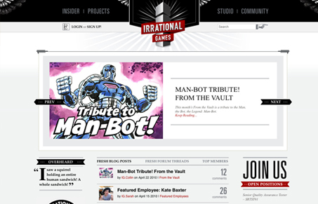
I really love the look of this website, it’s really beautifully done. There’s so much detail and it’s all done in a way where it’s not just thrown at you all at once. The site kind of bakes the wonderfulness in on you as you use it. I did a screen cast review of it so be sure and check out all the info from that. If I had one criticism to share it would be that it’s taken me a few visits and several minutes to really understand what the website is about. It seems like both a game studio and game portal all at one time – I’m thinking that’s what it is, but a sentence just placed somewhere on the home page would really help with conversions I think. Nothing drastic to the design, just a little primmer for guys like me who just come across the site.
This site is really beautifully done, and because of the detail work I spent and initial 10 minutes or so on the site just reading and looking over it. That’s a big success with the design in my opinion. Keep up the great work!


0 Comments