Via @burciaga
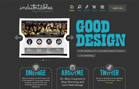
AND another nice site redesign by @deniselchandler indubitablee.com
We’ve looked at a number of Ms.Chandler’s designs and they are all pretty sweet. Her designs are very illustrative and her style is big and bold and sort of ‘anti-elitist-designer-ish’ (I think I’ve just coined an insufferable term). She has a great pitch on her homepage “Good design is the backbone of a successful business venture … or something”. Its the last part that really lets you understand her aesthetic. Her designs look very hand crafted, like digitized paper cutouts … or something 🙂 The work is good mix of nice structure, simple content and lovely art.
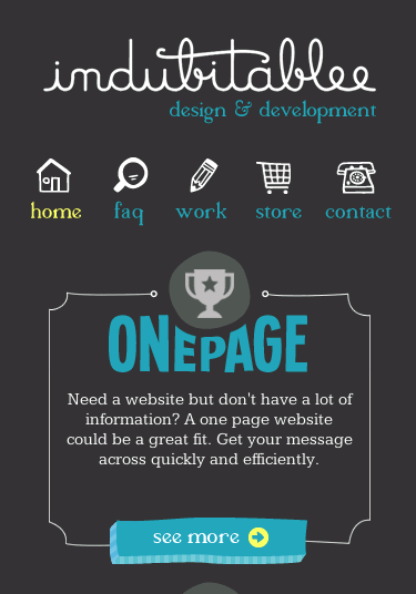
Also brilliantly responsive!
Also check out our review of Denise’s work “silly poems for kids“.


0 Comments