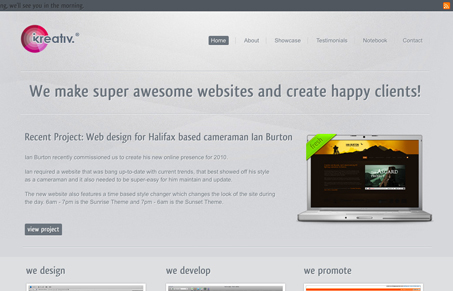
I like how the header strip fades a bit when you scroll the page, that’s a nice touch. The background looks good and keeping it static makes it really stand out as a design element all it’s own. There’s some readability issues for me with the dark type on a dark background down in the footer area. Overall though it’s a nice clean layout with a couple of little subtle surprises.
Glassmorphism: The Transparent Design Trend That Refuses to Fade
Glassmorphism brings transparency, depth, and light back into modern UI. Learn how this “frosted glass” design trend enhances hierarchy, focus, and atmosphere, plus how to implement it in CSS responsibly.


0 Comments