
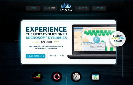
I’m not sure what to say about this site except that I’m pretty sure I’m not the target demographic. I barely know what a CRM is, and I can only assume that an XRM is more… something than a CRM. As far as the design goes, it’s designed and put together well. Nothing seems out of place and it’s laid out in very logical, linear fashion. However, the dark tone and the overall width lend a slight feeling that it’s all just a bit too squeezed in, as if I’m looking at the site through a porthole. Otherwise it’s a decent site, if you need to ‘Experience the Next Evolution in Microsoft Dynamics’.




0 Comments