Submitted by: Julien Muckensturm @iafactory
Role: Designer & Developer
IAFACTORY is an original information architecture design studio.
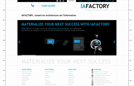
IA Factory is a design firm that puts a lot of emphasis on wireframes and information architecture, and they’ve used that concept of the underlying structure as a starting point for the design of their website by having a graph paper background, dotted lines and even rulers on the edge. Overall, it’s successful in that it’s logical and easy to navigate around. There is a problem with the hierarchy in that most elements as you go down the pages, however. The navigation at the top is too small and fiddly, and then there are large blocks of type with lots of white space around them. It would be nice to have a little more balance on that front.
Do make sure to check out their UI magnets. These seem like they could be really cool.


0 Comments