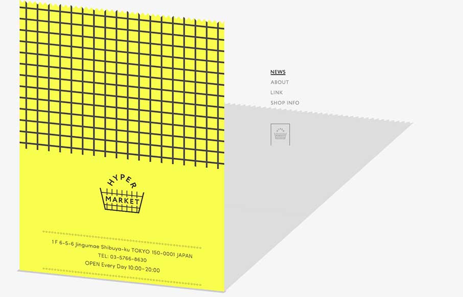
Ok – it took me a minute to see what Hyper Market’s website was doing here. Scroll all the way down, and you see the gray on the right is a shadow of the yellow that’s scrolling up the screen – which is a cool effect. To accomplish that, it looks like they used an iframe on the yellow part, and the skewed shadow is part of the regular html. So is this a new way to use an iframe? A good or bad use? I’m not sure, but it provides something that’s a little different than what you see every day – which is always good.
Glassmorphism: The Transparent Design Trend That Refuses to Fade
Glassmorphism brings transparency, depth, and light back into modern UI. Learn how this “frosted glass” design trend enhances hierarchy, focus, and atmosphere, plus how to implement it in CSS responsibly.


0 Comments