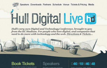
I really like the scribbly, sketchy look going on on this site. It’s cool and accessible and adds a bit of interest to a fairly simple site. The muted colors really work well with the skecth and the texture. I would like to see the huge header get smaller on the subpages so I wouldn’t have to scroll so far down to see any content. And while I think the sketchy effect is cool, it’s a bit too much on the speaker photos. I’d rather see a full color photo than a washed out monochromatic photo, and in that case I think the content of the photo is more important that staying rigid to a design scheme. Otherwise this is a nice site and I wish them well on their conference.
Submitted by Rob Palmer, @branded07. Designer & Developer.
Hull’s very own Digital and Technology Conference, brought to you from the KC Stadium. For people who love digital, and companies that need to do more with technology and the web


Holy shit, this site is amazing, good job on the whole coding & designing! The whole sketchy theme brings the site a little life, something a lot of sites lack! Great work!
– MexiChriS