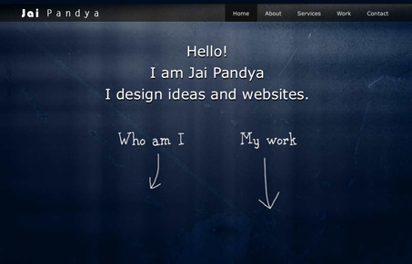
I like the mix of hand drawn lettering and the computer set font. I really like the background image and texture specifically. As for the single page slider type page scrolling on this design I could take it or leave it, I don’t think it’s central to the site working but it does help it flow well.
Glassmorphism: The Transparent Design Trend That Refuses to Fade
Glassmorphism brings transparency, depth, and light back into modern UI. Learn how this “frosted glass” design trend enhances hierarchy, focus, and atmosphere, plus how to implement it in CSS responsibly.


I’m pretty sure this is a template ….
Link?
http://themeforest.net/item/terminal-velocity-minimalistic-single-page-folio/54699
I get my stock resources from the envato websites.
I knew i’ve seen it 🙂
Seems like the person himself is the creator of the template : http://themeforest.net/user/jaiz