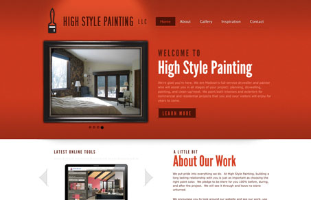
I love the dark & rich red color used in the top half background. They type is also very clean & strong. There are lots of interaction points that flip content around, but you’re never left having content hidden from view on page load – I really like that. In fact that’s a perfect way to use these little slideshows around your site to deliver deeper content. Each page of this site is also different enough to really keep the experience going for you. Extra neat contact us page/form too. Great work!
Glassmorphism: The Transparent Design Trend That Refuses to Fade
Glassmorphism brings transparency, depth, and light back into modern UI. Learn how this “frosted glass” design trend enhances hierarchy, focus, and atmosphere, plus how to implement it in CSS responsibly.


0 Comments