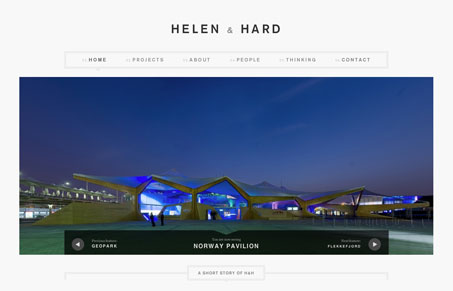
I always like a good website for an architecture firm. It’s clean and crisp and makes me think it’s Scandinavian, oh yeah, it is. I particularly like how the visual hierarchy is so self-evident, you go from super huge image to smaller boxes of older news. The news boxes load pretty dynamically when you click the “more news” at the bottom of the page too. Then as you make your way through the sub pages it’s all broken up with circles of images, very clever.
Glassmorphism: The Transparent Design Trend That Refuses to Fade
Glassmorphism brings transparency, depth, and light back into modern UI. Learn how this “frosted glass” design trend enhances hierarchy, focus, and atmosphere, plus how to implement it in CSS responsibly.


0 Comments