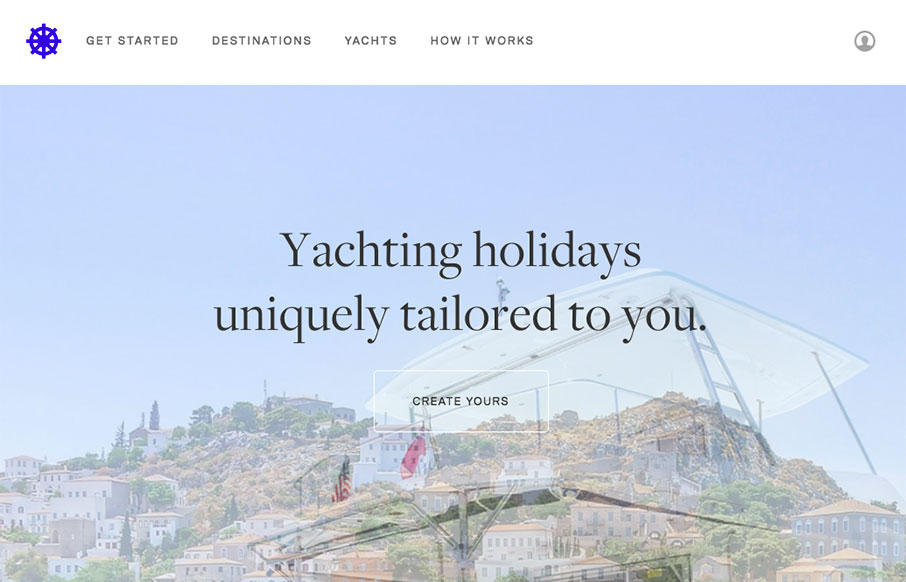
I like how this design feels very open. The interactive parts are sort of placed on top of the imagery to make it feel like it’s floating there. There is also a play between the back and forward arrows and the entire, oversized, image changing out too. Cool visual moment.


The Call to Action, Revisited
The Call to Action hasn’t changed in a decade, but the bar has. A fresh look at prominence, copy, mobile tap targets, and accessibility, with lessons from three major design systems.


0 Comments