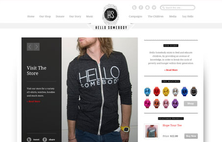
Really nice design with some pretty cool details. I love the finger print logo/icon that’s carried through the site’s other details. This is a great design, but there’s also a lesson to be learned here. The main image of Axel Rose or whomever that is, totally puts the design off kilter. It takes you a minute to fully realize this site is there to help children in Africa. The image totally makes sense, it’s just that if it’s the first real image you see the tone isn’t set properly IMHO. The second image of the boy at the schooldesk is a much better example of the first image that should load. Super great website with super great detail work.


0 Comments