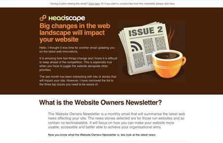
This email newsletter by Headscape is pretty great, the visual design isn’t going to change the world but it’s effective and to the point. The single best thing that makes this newsletter great is that it’s focused. It’s a newsletter for Headscape’s clients, period. They’ve targeted the content to really be informative, to give the subscriber real value.
Paul Boag (@boagworld) give a really good primer on this topic in one of his recent AudioBoo segments.
Use email marketing but make it user focused:
It’s not full of the typical self congratulatory promotional content that most web design company newsletters fill themselves up with. Typically we take a company newsletter and make it about, well, our company. Completely forgetting to give our clients/subscribers something that’s worth their time to read. That’s the big success here. I supposed it’s not totally right to put something in the UMS gallery mostly for content, but that’s the reason for this review and I think it’s a great lesson.


0 Comments