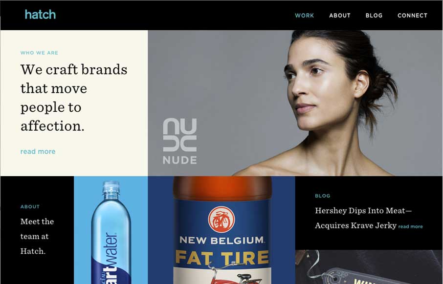
Really like this sleek design from the Hatch agency out of San Francisco. It’s a cool way for an agency to show their work and present themselves as innovative and cool. I’ll keep watching this site to see how they update the images, if they change the shape of the page as they add new projects to the home page. Also am liking the trend to add some horizontal to normal vertical pages (like they do in the Work Detail pages), not making the page so long in the scroll, adding a slider part way through (that you have to click to go left or right).
Glassmorphism: The Transparent Design Trend That Refuses to Fade
Glassmorphism brings transparency, depth, and light back into modern UI. Learn how this “frosted glass” design trend enhances hierarchy, focus, and atmosphere, plus how to implement it in CSS responsibly.


0 Comments