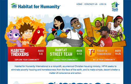
It looks like one more philanthropic organization has outdone themselves (finally) with a great looking website. Habitat for Humanity’s Youth Programs website makes use of a bright and energetic color scheme, great illustrations, and just the right amount of Flash for an added bonus.
The artwork is probably the most interesting and useful aspect of the website. The illustrations represent their respective sections of the website very well, and with the bright colors they use, the site is more inviting and effective. It doubles as narrative in itself through the illustrations as visitors are able to gain an accurate picture of what lies ahead in those sections.
Everything just comes together on this site, and it’s no wonder with the combination of graphic artwork, photos, Flash, and a great color scheme that represents the site’s theme and purpose. The added Flash photostreams combine with the illustrations to make the site much more engaging, especially for the youth who this site seem to be targeting.
There’s a lot to love about Habitat for Humanity’s Youth Programs website, including their great looking navigation and site graphics, but the really stand-out part is actually the entire site. Every aspect falls together and brings out a great, humanitarian theme and really makes the site shine. Here’s to making our youth unmatched as well.


Mark – thanks for the awesome writeup! We loved working on the project and were thrilled with the way it turned out… glad to see we’re not alone.