
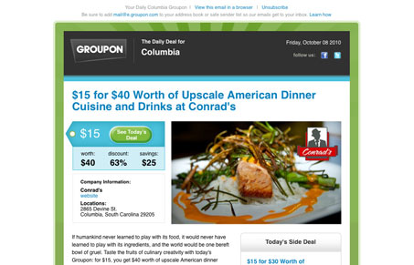
I’m sure by now everyone has seen the Groupon emails. If you haven’t and they do Groupon in your city, sign up & don’t miss out. But the email design is very effective. I think the design is very clear, with the sweet spot area (the top left corner and about a 300px by 300px square out from that corner) clearly filled with the logo and “$15 for $40” as the first characters of the headline you read. That’s really all you need to know to read more. Then the colors and photography are top notch, they always are on their emails. This thing just really drives the sale home for me. Great work!




0 Comments