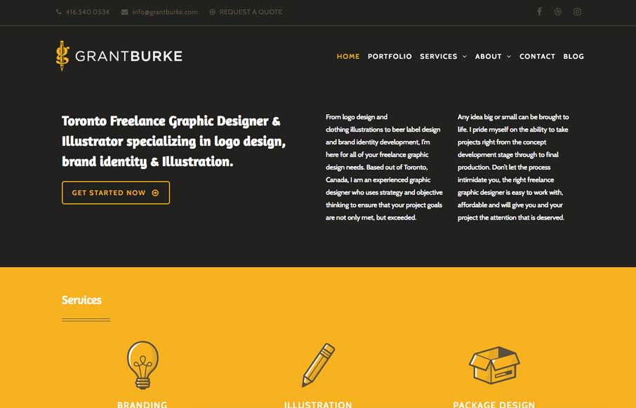
Neat interaction work here for Grant Burke’s website. I like how the header/logo/nav changes around as you scroll. Nifty color choices too. The thing I love most is the multi-column layout for wider screens. You simply don’t see that often and when I see it done well I luurrvvee that sort of stuff.


The Call to Action, Revisited
The Call to Action hasn’t changed in a decade, but the bar has. A fresh look at prominence, copy, mobile tap targets, and accessibility, with lessons from three major design systems.


0 Comments