
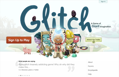
While not as great as their earlier beta site that we reviewed here on UMS. I still like this iteration. It’s clean and open and the lighter background/approach I think suits the game better. I many ways it’s a much simpler approach for the content, which could easily make the site overwhelming, which they haven’t. So good work there. Overall pretty good looking game website.




0 Comments