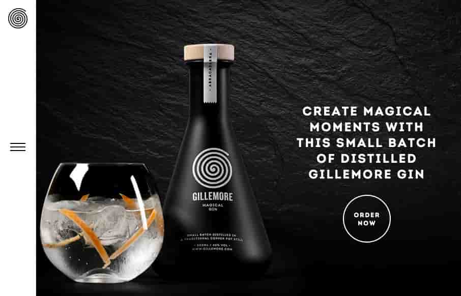
Nice upscale look for the Gillemore Gin’s website. I like the black/dark vibe, it really aides to the uniqueness of what the product looks like. Along side the slightly non-traditional feeling nav in the left hand side tray pattern the approach matches the look & feel very well.


The Call to Action, Revisited
The Call to Action hasn’t changed in a decade, but the bar has. A fresh look at prominence, copy, mobile tap targets, and accessibility, with lessons from three major design systems.


0 Comments