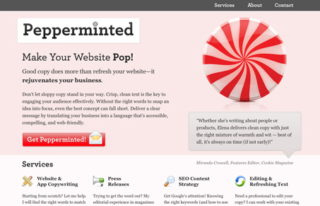
Pretty cool single page website for a copywriter. I like the “pepperminted” concept and the light pink color for the two sections of the page. I’d love to see more depth in the site and some work samples, and that’s to be taken as a good thing for sure!


This site is great. It got its point across clearly and smoothly. It didn’t try to BS me with psudo-calls to action.
I loved the subtle use of Jquery for scrolling as well.
The summary above hit it on the head, I would have liked to see some examples of her work, but as a stand alone design it was well executed.