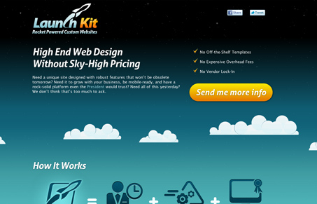
At first glance, this single page site has a really attractive background and overall feel. From the twinkling stars and moving clouds all the way down to the friendly astronaut that blinks when you hover over him. It’s a friendly-looking site that also holds up the professional end.
They start off the page with a really strong value proposition and a clear description of what they offer and how they might help you. The large icons carry that further and offer additional helpful info while maintaining the personal tone of their content.
You might think that it’s not very much to ask for only an email address to get more info, but as soon as you check off that little box indicating that you’ve got a project you want to launch right away, a few more form fields pop down. Nice touch, although my thought is that maybe a phone number field would serve well here.
Overall it’s a really well put together site. Oh, and watch for shooting stars!


0 Comments