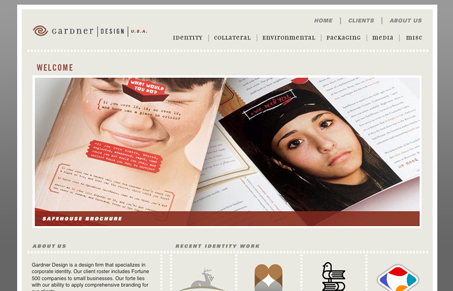
This site design is kind of old-school ad agency looking but I kind of like it. I especially love the portfolio section, which makes up like 85% of the site’s content. It’s extensive and the layout works perfectly. I just feel like I get caught up in new web techniques that i often miss good design because i’m looking for that stuff too much. This site doesn’t use any @font-face or typekit or jquery but it’s still a well crafted site. Cool to find.
Glassmorphism: The Transparent Design Trend That Refuses to Fade
Glassmorphism brings transparency, depth, and light back into modern UI. Learn how this “frosted glass” design trend enhances hierarchy, focus, and atmosphere, plus how to implement it in CSS responsibly.


This site seems a little under designed. I can see where they were going but the dotted lines seem a little too chunky and the typography is somewhat out of place. the navigation typeface is also hard to read.
That being said, I think the site is structured very well and the small graphics throughout are pretty stellar. Its extremely easy to navigate as the site is composed almost entirely of the portfolio work (as it should be).
I think that simplicity in a portfolio is great and in that regard this site certainly serves its purpose: it gets out of the way and allows the viewer to focus on the content. Still, its a seems a little unsophisticated as compared to the client work; which, by the way, is pretty beautiful stuff.