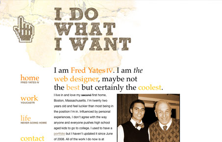
This is an interesting site design. Placed in the gallery here solely because of the navigation. Using the anchors based off a standard looking navigation – i’m torn on it. What do you guys think?
Glassmorphism: The Transparent Design Trend That Refuses to Fade
Glassmorphism brings transparency, depth, and light back into modern UI. Learn how this “frosted glass” design trend enhances hierarchy, focus, and atmosphere, plus how to implement it in CSS responsibly.


The highlighted colors threw me. I was expecting them to be links, like every other site on the planet that mimics the happy cog header navigation. Also, the copy makes you sound like a dick.
Ugh, I wish people would stop with the whole bravado thing. I’m glad he thinks he’s the coolest, but that tells me absolutely nothing about him, other than he has a high opinion of himself. It’s not funny or engaging.
As to the format, I don’t mind the moving navigation that much, the problem is that it’s laid out like a blog, and seems like a blog, but it’s not a blog. I scrolled down and thought every section was just another blog post, it wasn’t until I clicked on the links that I realized they were distinct ‘sections’. So, for what it’s worth, I generally scroll down a page before I click any links, and with this site you don’t really ‘get’ it unless you click on of the navigation links.
I just noticed, it’s in the ‘Blog’ subcategory, so maybe that proves my first point.
Design wise this site is confusing although I like his ‘out of the box’ layout. It really is just a blog, so I can’t be too critical. Its obvious this guy is young, probably somewhat privileged, and is using art as a means to rebel against his authoritarian family.
This kid could be a decent designer someday if he drops the ego and actually studies design. Overall, this page is much cooler than most Myspace pages (whatever that means to you…).