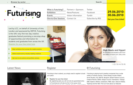
There is some interesting interaction work here on this website. The “browser by sector” fly-out is interesting. As well is the search box design. The site uses the underline pretty heavily for elements that aren’t normally underlined (only) on typical website designs. There is definitely a feeling of experimentation with this design and I quite enjoy it. This site is really worth spending some time with.
Glassmorphism: The Transparent Design Trend That Refuses to Fade
Glassmorphism brings transparency, depth, and light back into modern UI. Learn how this “frosted glass” design trend enhances hierarchy, focus, and atmosphere, plus how to implement it in CSS responsibly.


0 Comments