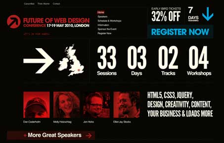
I love these sites Carsonified is kicking out lately, they seem to be on a roll with some good design. I like this one, the pairing of the red and black background makes for an interesting site. The giant image of earth in the footer is an unexpected surprise when you get down there.
Glassmorphism: The Transparent Design Trend That Refuses to Fade
Glassmorphism brings transparency, depth, and light back into modern UI. Learn how this “frosted glass” design trend enhances hierarchy, focus, and atmosphere, plus how to implement it in CSS responsibly.


Helvetica + Futura? that’s pushin it.
That may be, but holy cow, I just now caught the parallax effect over the red earth graphic in the footer. Was that there a week ago or am I just blind? Can’t believe I missed that. Pretty cool use of that effect and I’d say it’s a little subtle being at the bottom of the page too.
Quite like the style, can’t really think of the name for this style of design, buts it’s effective. It’s nice twist on the idea of an event website, the design has more character compared to previous years’. Shame it’s still a mountain of cash to go though, damn student life!
Thanks for the t-shirt by the way, got it yesterday! Appreciated 🙂
You’re most welcome Luke. We love our awesome little community and like to say thanks to the most loyal of our people!
I agree with you on the design too, they seem to be carrying this design through their big 2 conference types as well. The FOWA’s and FOWD’s. I have to say, having gone to FOWA Miami last year, it’s totally worth the money to go.