
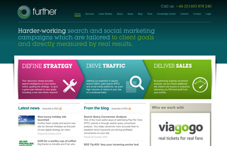
This is a rather interesting looking home page. It’s purely graphical in nature and really is easy to scan and understand. The little three step process main graphic is so clear and easy to grasp. The colors are interesting and the entire page is well laid out and looks nice. The site also has tons of great info and some nifty apps as well to help you be a better search marketer, they don’t seem all about just keeping the info to themselves which with me goes a long way with SEO companies.




0 Comments