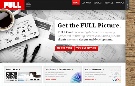
I like the colors in this site design. It’s largely dark grey and white with the red and blue colors worked in for some great contrast. The large images on the home page are nicely used as well. I both like and dislike the large background image, they look good, but can’t help but feel overwhelmed visually with some of them. Good looking site all in all.
Glassmorphism: The Transparent Design Trend That Refuses to Fade
Glassmorphism brings transparency, depth, and light back into modern UI. Learn how this “frosted glass” design trend enhances hierarchy, focus, and atmosphere, plus how to implement it in CSS responsibly.


amazing design, HATE left justified though unfortunately. The logo is genius.