Submitted by Adelle Charles, @adellecharles.
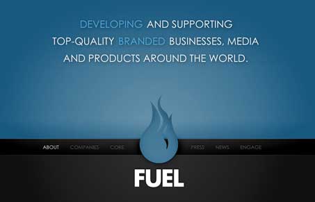
We really like the Fuel Brand inc. website. Jay and I did a screen-cast review of it. It’s a pretty memorable experience, it’s more than your standard javascript interaction styled website. The interactions are very well done, they’re almost minimal and I think that’s what makes it work so well. The color change between section is a nice touch. The other things like the over states on the profiles and the news section are great.
What’s really nice and something we missed while doing the screen-cast is that they have completely branded out their profile pages, twitter and down to their tumblr sites. That’s thorough and I have to say very impressive work.


I’m not a big fan of this. These guys seem really impressed by themselves, to be honest.
1. The logo. I’ve seen this a million times. Matchstic.com did it, Discoapp.com did it, Helio (which Matchstic just stole) did it. A solid “meh”.
2. The homepage. Why should i have to click or mouse over a tab to get navigation. Absolutely pointless, other than to sit back and think “Man, look at that GORGEOUS logo! Aren’t we clever?” Why not take a page from Google and have the nav load in when the mouse moves.
3. One page sites. For a site this deep, and even though it has a clever URL structure for bookmarking, there are still issues. For instance, I get to the “Core” section and click on the image, assuming something will happen. I’m on a slow connection at work, so nothing happens right away. I give up and move to the news section. Because the site is just loading everything into the same page, all the sudden, the old link I clicked loads and BAM, I’m now staring at the CTOs utterly pointless splash page thing.
4. Inconsistency. Some links open a new window, some open in the same window. I feel like every link is a landmine. Also, the About page, it’s not apparent that the colored words offer any interaction. I didn’t even notice that until the third or so time loading the site up.
5. Fuel Labs link is broken and the News section is really hard to navigate.
On the bright side, the sites are all very pretty. I apologize for the blunt tone. My mother didn’t hug me enough.
@John – We’ll hug you man! jk… seriously that was funny.
I hear you, to each his own in the end. I have to disagree to a point with you, while all your points are valid and we did kind of gloss over pointing some of that stuff out, heck we didn’t really dig into it as critically like you did. I still think the site is pretty memorable and that has to count for a lot to me personally.
I think the purpose of this site is to exist as an extension of the other Fuel websites. To give you background info on the company that runs the network, those sites are always pretty boring and honestly I don’t imagine that they get very much traffic, this one just had that certain something that makes me remember the experience. Good or bad…
I have to agree with John. I think this sums it up: “These guys seem really impressed by themselves, to be honest.”
In my opinion, FUEL puts out a lot of fluff, and then talks it up like it’s the best thing ever.
Still an interesting video critique, although I wouldn’t agree that FUEL’s designs are awesome. Good, solid design, but boring and not innovative. It lacks that unique, approachable feel and for me… their brand is stiff.
I think the main point about inconsistency is a good one and it’s something that does bug me a bit about the site. Each ‘page’ has it’s own look with it’s own effects and behaviors. This isn’t necessarily a bad thing, it’s just that aside from the field of color, nothing really ties the pages together.
I also think that if you have to have instructions for basic navigation elements (e.g. ‘Show Navigation’ and ‘Click again to view article’) you’re introducing unnecessary complexity that only serves as an opportunity for someone to miss out on the content.
Design is all subjective. The entire family of Fuel Brand sites has a very cohesive feel to me. It is refreshing to see a group of sites that interface together. Fuel Brand also provides a wealth of valuable tools and information for the creative mind. Oh and did I forget to mention that it is all free! By the way I don’t work for Fuel Brand. I just happen to like the whole concept. Having been in the television business for 25 plus years, Fuel Brand is a great place to get inspiration for new and creative ideas. The Fuel Brand Inc. site just proves to me that the creative team at Fuel Brand are turning their visions into reality. Thanks to the creatives at Fuel Brand Inc.
I too do not like this site. Actually, I find all the FUEL sites unpleasing to look at as they are, at best, elementary WordPress-looking websites. I think the FUEL is trying to mimic the Evanto series of websites and marketplaces, though they still need some work.