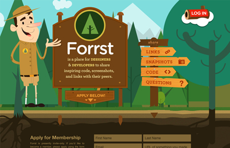
Mainly just a single page website on top of a web application. The illustrations sell it, the cleverness in delivery, “log in” just kills me… I like the call to action with the “apply below” button that scrolls you to the form, not totally necessary but it’s a nice clear action link. I’d love to get into this and see what the apps like! Hint… Make sure and watch the screen cast review of this site too.
Glassmorphism: The Transparent Design Trend That Refuses to Fade
Glassmorphism brings transparency, depth, and light back into modern UI. Learn how this “frosted glass” design trend enhances hierarchy, focus, and atmosphere, plus how to implement it in CSS responsibly.


Glad you like! Make sure you apply, invites are going out daily.
amazing. applied, and great work!
Oh yeah, you know I applied. Better let me in Kyle! jk – seriously though, let me in…